OVERVIEW | Our team was tasked with designing a website to serve as a central hub for Yale Intramural participants, providing easy access to schedules, scores, and standings while reflecting the competitive nature of IMs. SYSTEM:Figma | TEAM:Naomi Ling, Lily Lin | ROLE:Creative Director (UI/UX design) | TIMELINE:October - December 2024 |
|
PROBLEM | How can we make IMs information intuitive and accessible? The Yale Undergraduate Intramural program provides an outlet for athletic competition for the Yale community. In one year, this includes: - thousands of students
- 18 different sports
- almost 2000 individual matches
However, the existing IM information system relied solely on multiple spreadsheets that were visually cluttered and hard to navigate: 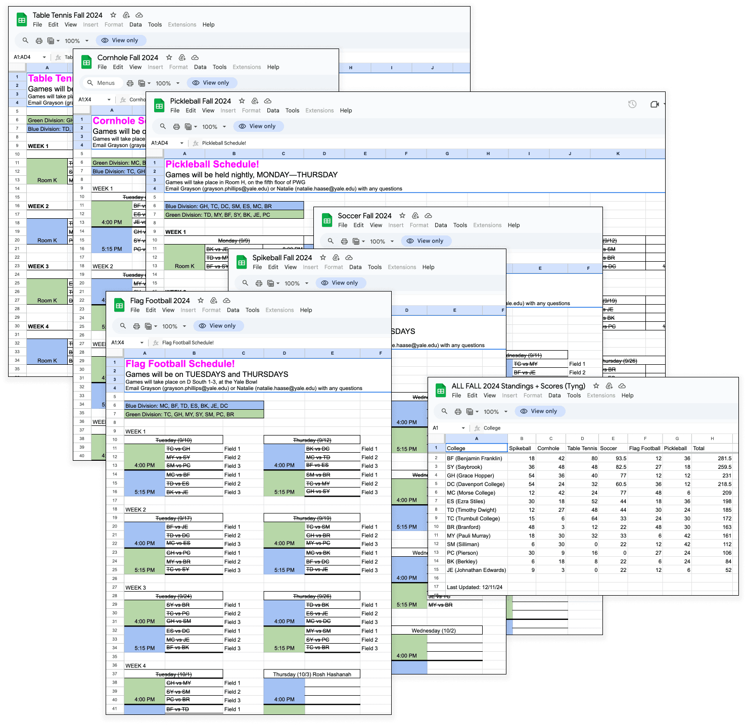 Seven separate spreadsheets were required to handle scores and scheduling for an individual season. Preliminary Issues: Before conducting user interviews, some shortcomings of the existing Yale Intramurals system were already apparent: - Manual Data Search: Users faced significant friction while navigating through multiple spreadsheets to find schedules or scores. Accessing information was thus time-consuming and prone to errors.
- Lack of Personalization/Filtering: The system lacked basic filtering functionality, such as viewing schedules or scores by college. Users had to use the “scan-F” approach or visually scan college name acronyms to find relevant data. This made it challenging for users to focus on the data that pertained to them/their respective college.
 Real messages from a Yale college’s IMs group chat, highlighting patterns of confusion Scaffolding: The Yale Computer Society (YCS) had already created a low-fidelity prototype, but it lacked insight into usability, organization and visual appeal.  The challenge was to design an accessible and visually engaging website. |
RESEARCH | We first conducted initial meetings with the Yale Computer Society (YCS) to understand needs and requirements: Key Insights: - Centralized Information: The website should serve as a central hub for intramural-related information, consolidating schedules, scores and standings all in one accessible location.
- Intuitive Navigation: The navigation system needed to be user-friendly; Key details, such as game schedules or results, needed to be available at a glance.
- Engaging Design: To reflect the intensity and competitive spirit of Yale’s IMs, YCS was looking for energetic, bold and visually exciting design, while still maintaining accessibility and clarity for all users.
As a Yale IMs secretary, I was able to interview several active Yale IMs participants in addition to those who were not involved, but showed interest in sports and Yale IMs. What challenges do you face with the current Yale IMs system?  What would you say is the overall vibe of Yale IMs?  While much of the user feedback aligned with the initial conclusions we had drawn and the discussions with the Yale Computer Society (YCS), the interviews surfaced additional insights on the event sign up system, largely using liked messages as a way to predict attendance and numbers. |
IDEATION | We began by identifying core pages and designing user flow, keeping in mind a streamlined interface.  Preliminary user flow chart with corresponding basic components for each page Upon visiting the website, the user must pass through a login page and API to sign into their Yale account in order to access the actual website. There, they start at the home/leaderboard page, which gives them access to all other pages through the upper navigation bar. |
PROCESS | We created low-fidelity wireframes to refine layouts and functionality: - We faced challenges with the scores and schedules pages, which function similarly, and ultimately combined list and calendar components to address this.
- The profile page lacked information at first, but we eventually determined how to present the most relevant details effectively.
Wireframes:  Low-fidelity wireframes First Iteration: Our first iteration of higher-fidelity prototypes were clean, but missed the mark:  - An original color scheme of royal, collegiate colors (crimson, navy and gold) was adopted, but felt bland and uninspired.
- The original font of ABC Diatype did not feel sporty or exciting.
- However, the organization and accessibility of information was appropriate and adopted in the final version.
Conclusion: We needed to pivot. New Visual Direction:  We chose a blue and white color scheme inspired by Yale’s identity, balancing boldness with clarity to reflect the competitive, sporty vibe of IMs. A grid system was used to create a clean, structured layout, subtly inspired by analog scoreboards for a nostalgic yet modern design.  JetBrains Mono is a font designed for developers and coding environments and was used to contribute to the analog-scoreboard-videogame aesthetic. The font's clarity and modern design ensured readability while enforcing the competitive atmosphere of IMs. |
IMPLEMENTATION | After finalizing the prototypes, we collaborated with YCS to hand off designs for development. They hope to deploy the website by February 2025. |
REFLECTION | Impact: The redesigned Yale IMs website successfully addressed key pain points identified during research, resulting in: - Simplified Navigation and Centralization: Consolidating schedules, scores, and standings into one hub reduced confusion and made information more accessible, saving users valuable time.
- Enhanced Usability and Aesthetics: The website’s intuitive navigation and bold, sporty design fostered greater engagement, encouraging users to interact more frequently with the IMs system.
- Lowering Barriers to Participation: Perhaps most importantly, the platform made IMs more approachable and inclusive. By eliminating the inefficiencies of scattered spreadsheets and simplifying communication, the website inspired greater interest and lowered the threshold for students to participate in IMs activities.
Skill Development: - User-Centered Design: I strengthened my ability to design with users in mind by identifying their pain points through research and interviews. Iterating on feedback ensured that the final product addressed their needs intuitively and effectively.
- Client Communication: Working with the Yale Computer Society (YCS) taught me the importance of clear communication with clients. Setting clear expectations about deliverables, timelines, and design decisions helped align our vision and goals. I learned to actively listen to their feedback, incorporate it where possible, and provide rationale for design choices to ensure they felt confident in the direction of the project.
- Maximizing on Collaboration: Collaboration was another key takeaway. Working with my team and the YCS team highlighted the importance of leveraging different perspectives and skill sets. By combining our efforts, we were able to address complex problems and create a polished, impactful design.
- Adaptability in Design When initial prototypes didn’t fully capture the energy of Yale IMs, I learned the importance of being flexible and open to rethinking design choices. This iterative process allowed us to refine the visual identity and functionality, ensuring the final design aligned with both the competitive culture of IMs and user needs.
Lessons Learned: - Although user feedback was a significant part of the early design process, ongoing user testing during the mid- and high-fidelity prototypes would have helped refine the design even further
- While anecdotal feedback was positive, I wish I had implemented ways to collect quantitative data, such as metrics on participation rates or user engagement. These numbers would have provided concrete evidence of the redesign’s success and areas for future improvement.
|
PRODUCT | 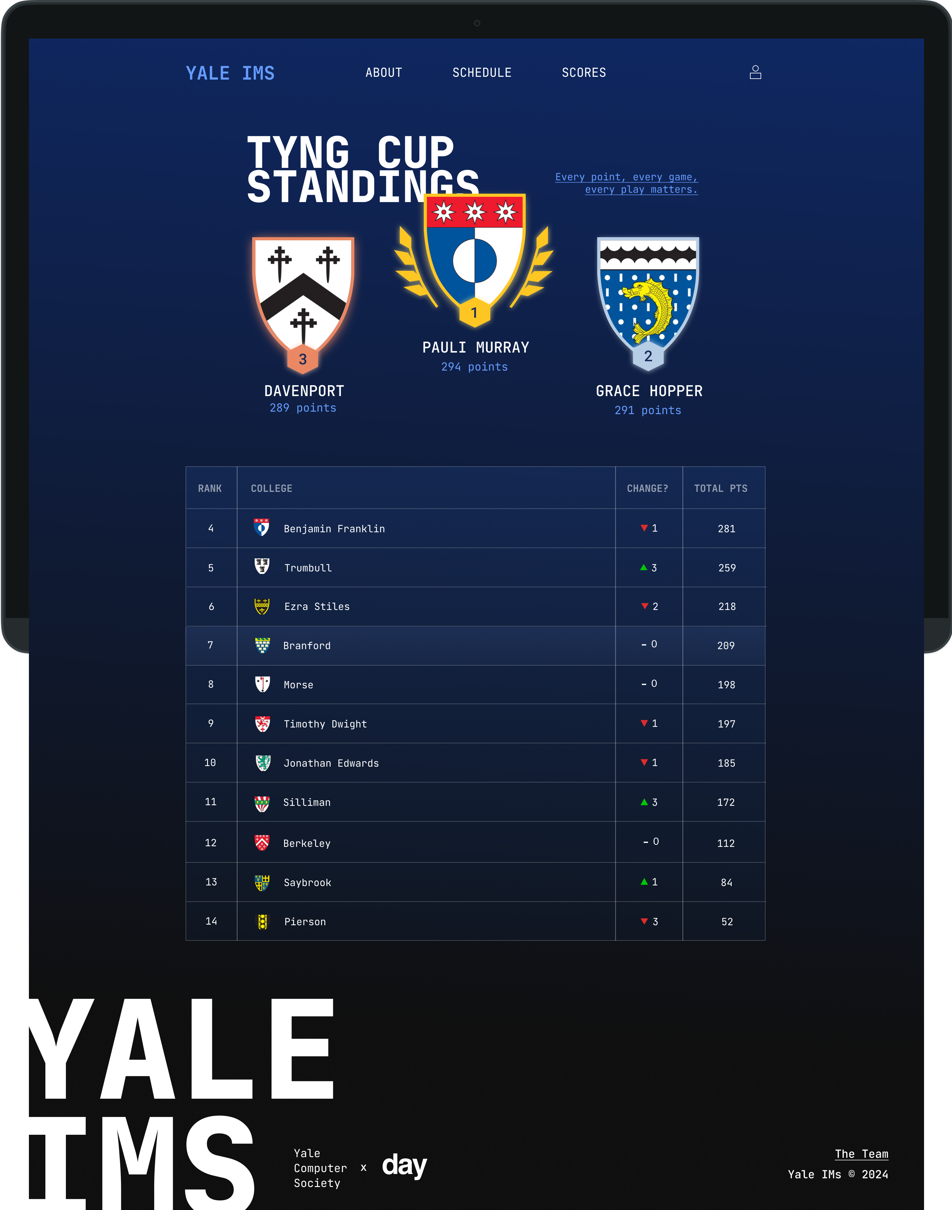 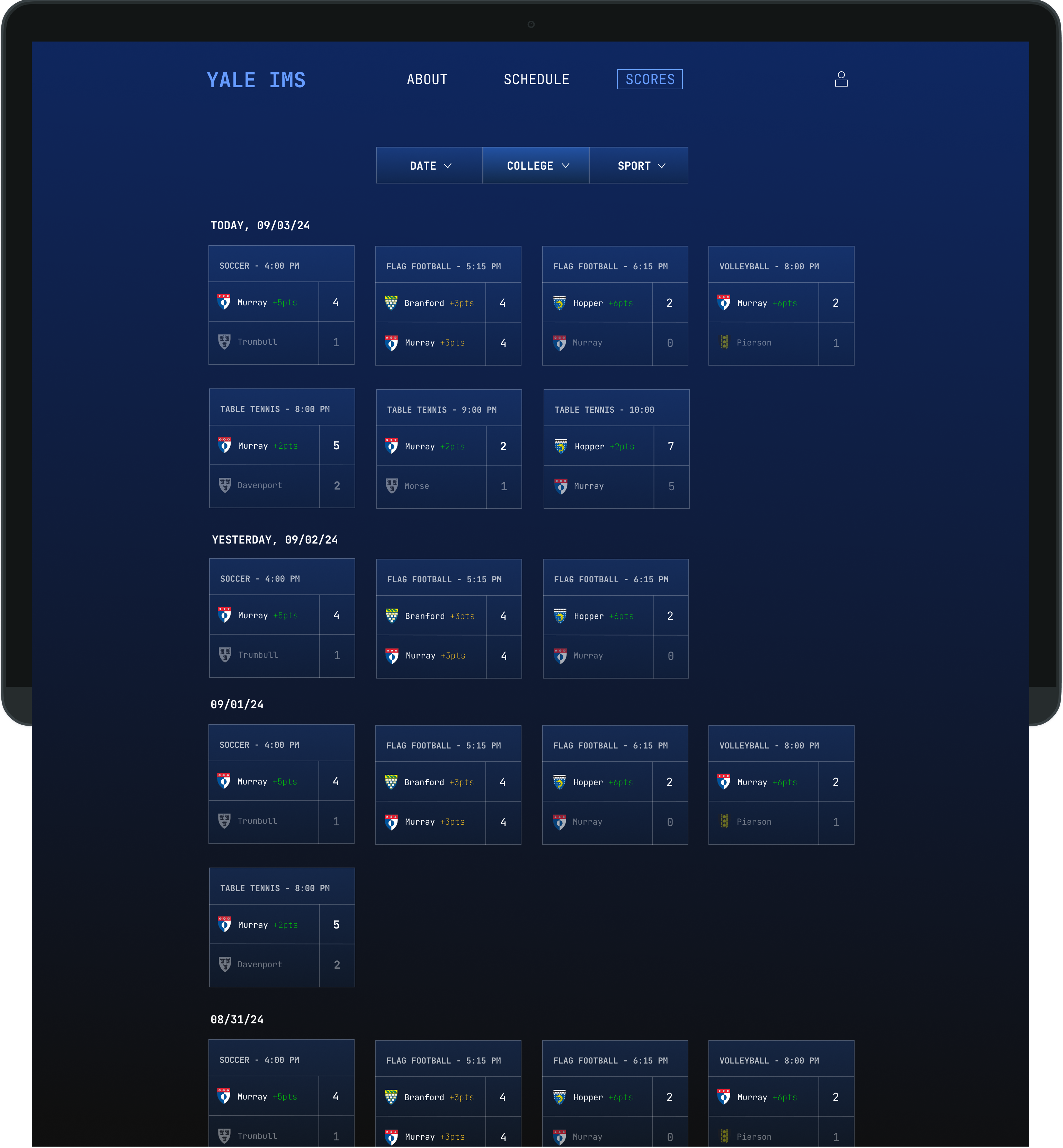 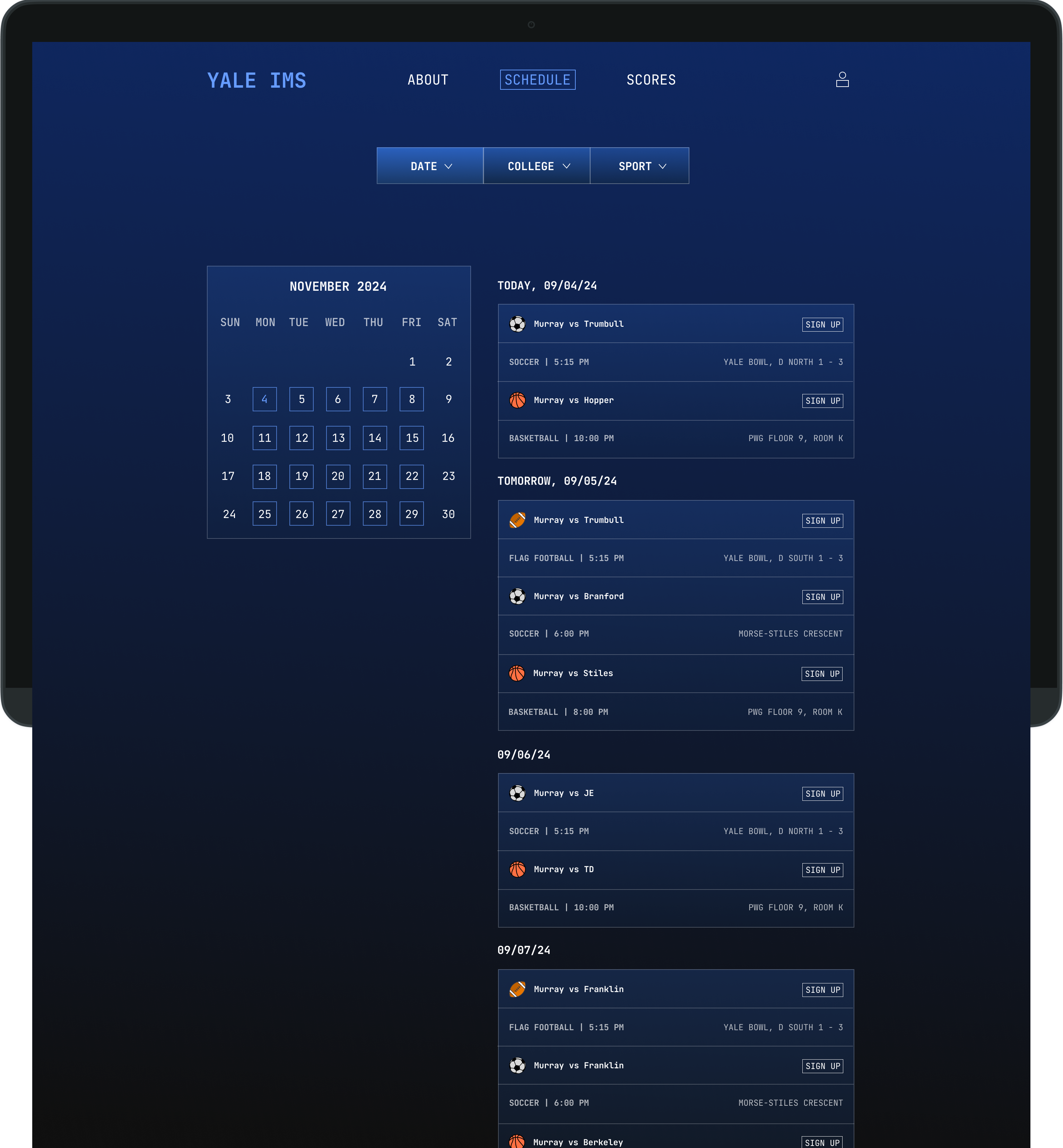 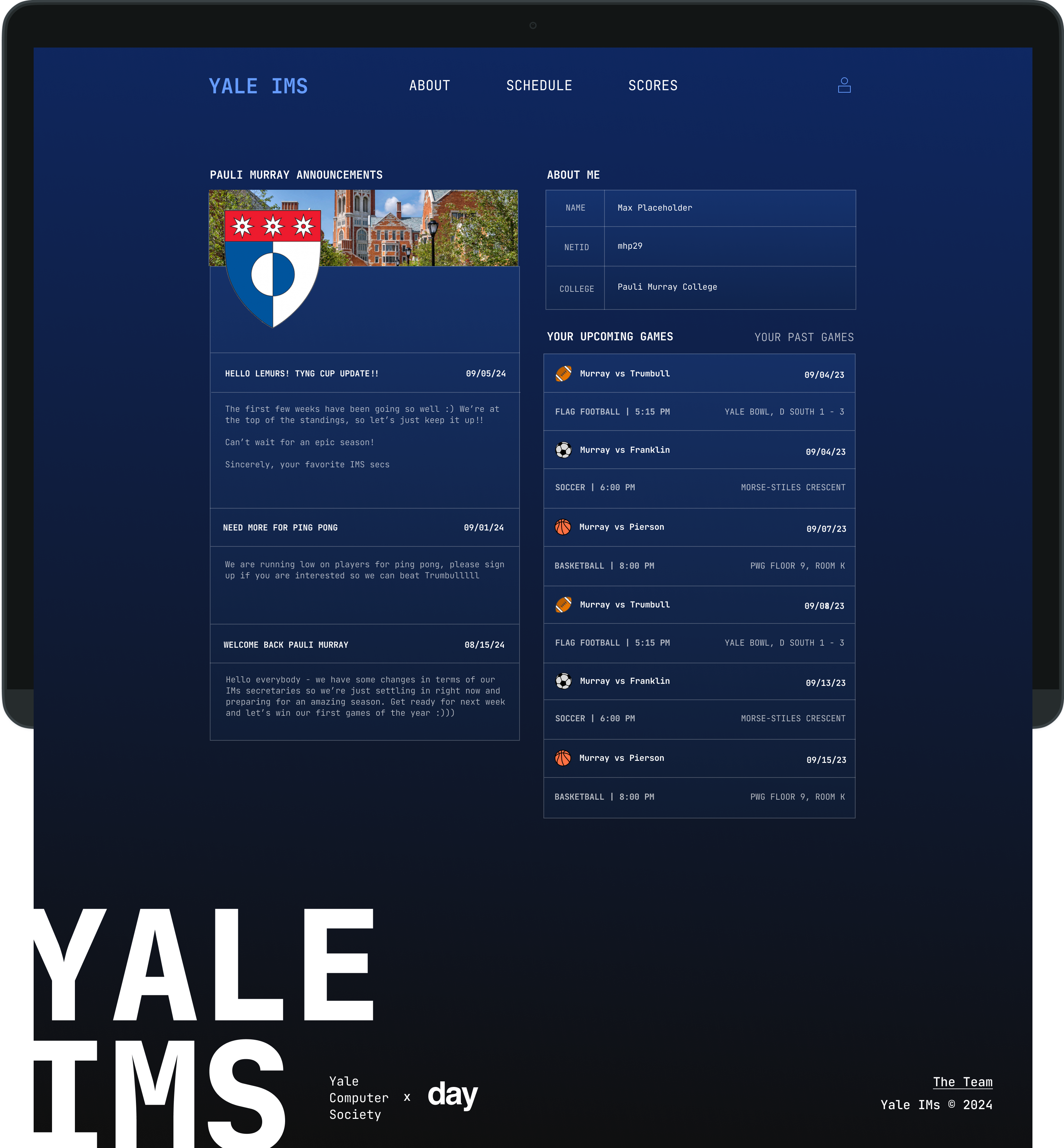 |
